
Version 1.0.0
This pattern library is here to help to create and maintain a unified UI.
Table of content
- Table of content
- Introduction
- Setup Atomic Bulldog
- Atomic Design
- Pattern styleguide (Node KSS)
- Naming convention
- Project Structure
- CSS custom properties (CSS variables) and Sass variables
- Recommended vendors
- Resources
Introduction
This project is base on Atomic Bulldog boilerplate.
Atomic Bulldog is a Scss(Sass) boilerplate base on atomic design methodology. It integrates Node KSS to automatically generate a live styleguide/pattern library.
Setup Atomic Bulldog
Once this project clone you can run:
npm install
Sass is compile using Gulp. You are free to use another task runner or compiler
To compile your Sass, generate the live documentation and run BrowserSync on change run:
npm run startAtomicBulldog
This command can be change in package.json
Other commands:
// Build kss styleguide
npm run kssWatch

// Watch kss styleguide
npm run kssBuild

// Build scss
npm run gulp scssBuild

// Watch scss
npm run gulp scssWatch

// Build js
npm run gulp jsBuild

// Watch js
npm run gulp jsWatch
Atomic Design
Atomic design is a methodology for helping to design and develop a pattern system.
This methodology has been defined by Brad Frost as so:
Atomic Design details all that goes into creating and maintaining robust design systems, allowing you to roll out higher quality, more consistent UIs faster than ever before. This book introduces a methodology for thinking of our UIs as thoughtful hierarchies, discusses the qualities of effective pattern libraries, and showcases techniques to transform your team's design and development workflow.
Example:
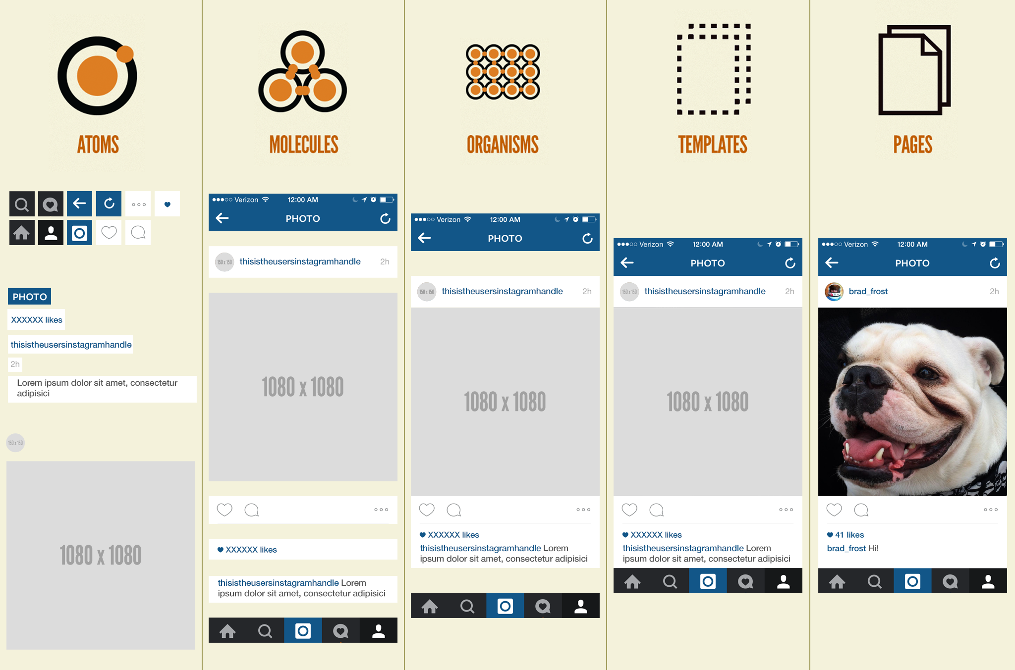
Atomsare UI elements that can’t be broken down any further and serve as the elemental building blocks of an interface.
Moleculesare collections of atoms that form relatively simple UI components.
Organismsare relatively complex components that form discrete sections of an interface.
Templatesplace components within a layout and demonstrate the design’s underlying content structure.
Pagesapply real content to templates and articulate variations to demonstrate the final UI and test the resilience of the design system.
Atomic Design resources
- Brad Frost has written some great resources on the Atomic design methodology:
- Other resources:
Pattern styleguide (Node KSS)
A pattern library is a library of individual styles, components, and guidelines used for creating unified UI.
Atomic Bulldog uses Node KSS to generate its styleguide.
Inspired by TomDoc, KSS attempts to provide a methodology for writing maintainable, documented CSS within a team. Specifically, KSS is a documentation specification and styleguide format. It is not a preprocessor, CSS framework, naming convention, or specificity guideline.
This is a Node.js implementation of KSS, "a documentation syntax for CSS" that's intended to have syntax readable by humans and machines. Hence, the kss-node software can be used to create a "living style guide".
KSS Config
KSS settings can be changed in kss-config.json, you can add and remove CSS and js files. You can as well change where the KSS documentation will be output.
KSS documentation format
The basic format for KSS documentation can be best explained in an example:
.btn{
  //Style
}

// Buttons
//
// Description of the element
//
// Markup:
// <button class="btn {{modifier_class}}">.btn .{{modifier_class}}</button>
// <button class="btn {{modifier_class}} is-outlined">.btn .{{modifier_class}} .is-outlined</button>
// <button class="btn {{modifier_class}} is-hovered">.btn .{{modifier_class}} .is-hover</button>
// <button class="btn {{modifier_class}} is-focused">.btn .{{modifier_class}} .is-focused</button>
// <button class="btn {{modifier_class}} is-rounded">.btn .{{modifier_class}} .is-rounded</button>
// <button class="btn {{modifier_class}} is-loading">.btn .{{modifier_class}} .is-loading</button>
// <button class="btn {{modifier_class}}" disabled>.btn .{{modifier_class}} disabled</button>
// <button class="btn {{modifier_class}} is-theme-default">.btn .{{modifier_class}} .is-theme-default</button>
//
// .is-primary - Primary color
// .is-secondary - Secondary color
// .is-link - Link color
// .is-success - Success color
// .is-danger - Danger color
// .is-warning - warning color
// .is-light - light color
// .is-dark - dark color
//
// Styleguide Atoms.button
- The first line will be the title of the section, in this example it is
button. - Then we have the description of the element, we can add markup as well (i.e to embed a video or caniuse table).
- We can show an example we a snippet by adding
markup:following by the element's HTML. {{modifier_class}}allow to show several example of the block with different classes here .is-primary, .is-secondary etc.- Finally the last line allows organize this section, In this example, it will be in Atoms/Button.
KSS resources
- Build a Style Guide Straight from Sass
- kss-node
- Knyle Style Sheets Documentation
- Knyle Style Sheets
- Great style guide examples
Naming convention
Atomic Design does not come with a naming convention. The only convention is around modifiers classes they start by 'has-'or 'is-', for example 'class="btn is-outlined is-primary"'
Project Structure
The heart of Atomic is the pattern system. To manage and create these patterns we use the variables folder all the patterns will be declared in there and an associated function is created to reuse this pattern. For examples, colors are set in this folder that can be used with the Sass function color(your color) (See Sass variables page).
As we saw in a previous section, Atomic Bulldog is base on the atomic design methodology. Naturally atom elements will go in the atoms file, molecules in molecules file etc.
The layout folder contains the grid system of the project.
Sass project structure:
Atomic Bulldog:
| \---scss
|     +---atoms
|     |   +---forms
|     |   +---modifiers
|     |   \---typography
|     +---functions
|     +---layouts
|     +---mixins
|     +---molecules
|     +---organisms
|     +---settings
|     +---templates
|     +---themes
|     |   \---variables
|     +---variables
|     \---vendors
|         +---a11y
|         \---icomoon
With description:
Atomic Bulldog:
| \---scss
|     +---atoms - UI elements that can’t be broken down any further and serve as the elemental building blocks of an interface.(brand, burger btn, img...)
|     |   +---forms - (inputs, label, form description)
|     |   +---modifiers - (spacing, text, bg color...)
|     |   \---typography - (titles, paragraph, list...)
|     +---functions - Global sass functions
|     +---layouts - Grid system
|     +---mixins - Global sass grid
|     +---molecules - Element base on atoms that form relatively simple UI components. (form group, navigation)
|     +---organisms - Relatively complex components that form discrete sections of an interface (Navigation header bar, form)
|     +---settings - Global sass settings
|     +---templates - Global pages layout
|     +---themes - Alternative themes
|     |   \---variables
|     +---variables - Sass variables help to define patterns in the project
|     \---vendors - External resources
|         +---a11y
|         \---icomoon
CSS custom properties (CSS variables) and Sass variables
CSS variables
By default, this project compiles almost all of its variables to CSS variables.
A flag is set up in the project $use-css-var in _atomic-bulldog-settings.scss, that can be changed if you do not want to use CSS variables.
SCSS variables
This project uses mostly maps variables link to a function associated with this map.
Sass Maps are used so it is easier to create a pattern and to follow it.
Variables files follow this pattern:
// ------------------------------
// Sass Variables
// ------------------------------

// CSS variables prefix
$variable-prefix: --variable-;

// Map declaration
$variables : (
  var1: value1,
  var2: value2,
  var3: value3
);

// ------------------------------
// Set function
// ------------------------------

// We link the map and prefix to a function

@function functionToCallVariables($variable, $true-val:false) {
  @if $use-css-var == true {
    @if $true-val == true {
      @return map-get($variables, $variable); // True Val
    } @else {
      @return var(#{$variable-prefix}#{$variable}); // CSS Var
    }
  } @else {
    @return map-get($variables, $variable); // Disabled CSS Var
  }
}

// We call our map in the project using this function
//
// Example:
// functionToCallVariables(var1) => --variable-var1
// functionToCallVariables(var1, true) => value1
// functionToCallVariables(var1) and $use-css-var: false => value1

// ------------------------------
// Set root variables
// ------------------------------

@if $use-css-var == true {
  #{$root-default} {
    @each $name, $variable in $variables {
      #{$variable-prefix}#{$name}: $variable;
    }
  }
}

// ------------------------------
// KSS Documentation
// ------------------------------

// Document you new variables
Recommended vendors
- https://github.com/edenspiekermann/a11y-dialog
- https://a11yproject.com/patterns
Resources
- https://marijohannessen.github.io/color-contrast-checker/
- https://www.w3.org/TR/WCAG20/
- https://github.com/brunopulis/awesome-a11y
- https://github.com/Khan/tota11y
- https://github.com/github/lightcrawler